Epicure Café
BRAND REIMAGINED
We Took This Classic Café
from “Sweet Grandma” to
“Cool Aunt Who Travels”
Epicure Café has been holding it down in River Oaks for years—family-owned, community-loved, and rocking a maroon-and-white aesthetic. The food? Fantastic. The vibe? Stuck in a simpler time. So, we had to shake things up—gently, respectfully, like you'd rearrange your grandma’s living room... but with better lighting and less maroon.
Here’s how we gave Epicure a glow-up without losing the soul
Logo Redesign: Out with the generic sans serif, in with a luxury logotype that feels as warm and intentional as their scratch-made menu. Clean. Confident. Still friendly enough to say hi to your dog.
New Color Palette: We kicked maroon to the curb and introduced a grown-up, earthy trio of rich brown, creamy beige, and olive green. Think organic brunch meets editorial spread. These colors look good on walls, websites, and cappuccino foam.
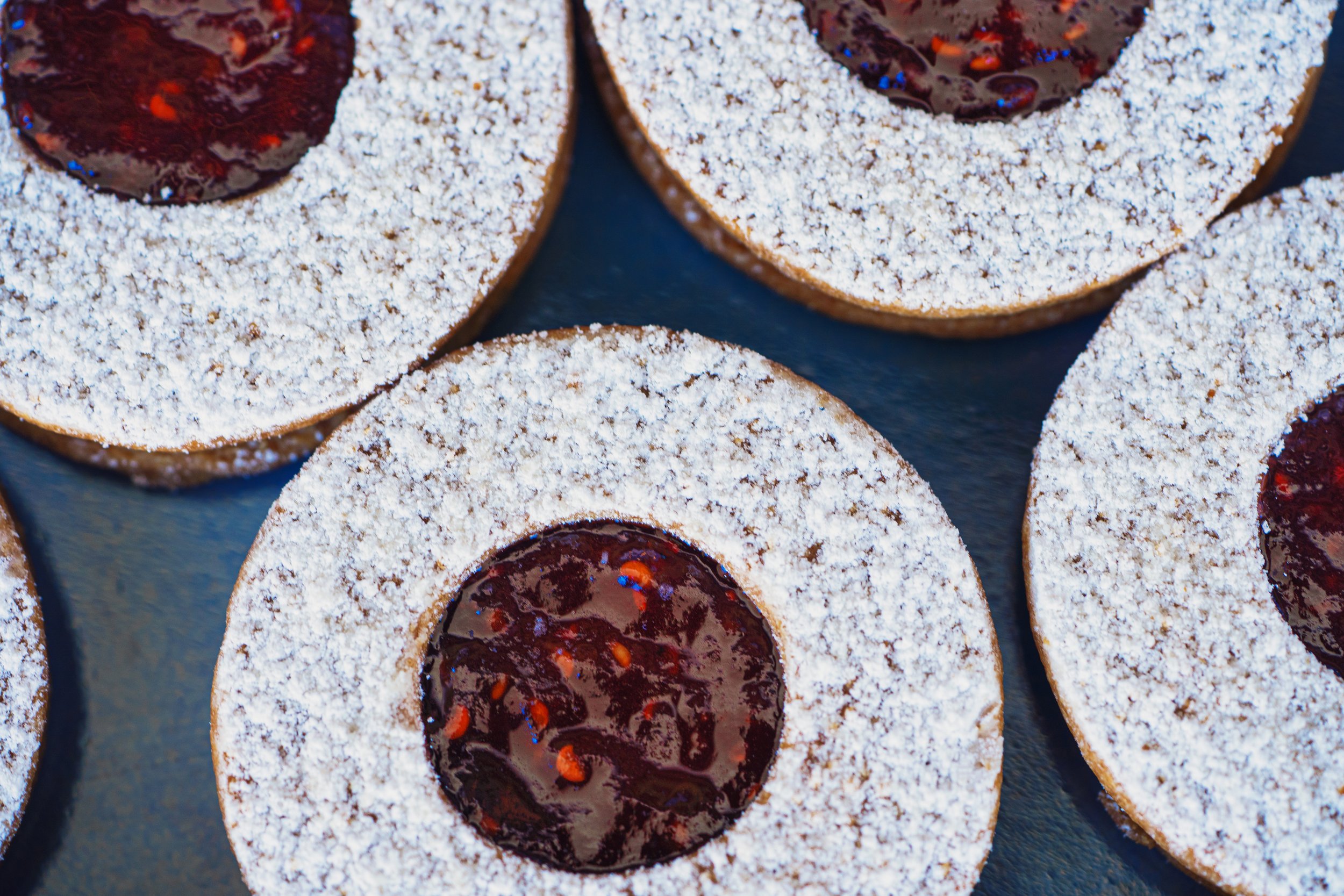
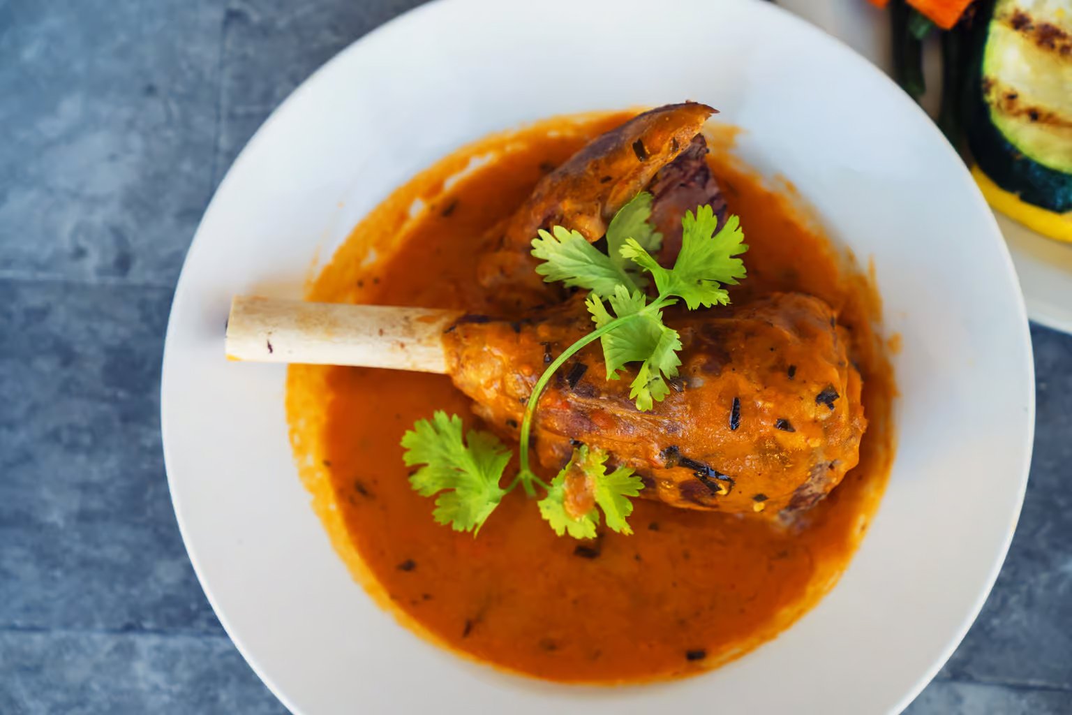
Photography Direction: We ditched the flat iPhone snapshots and brought in natural light and real texture. Nothing staged, nothing cheesy (unless it’s in the pasta). The new visuals highlight the depth of the space and the flavor of the menu.
Website Revamp: The new site got a much-needed makeover—clean layout, familiar type, color that doesn't offend your eyes. It's easy to navigate and actually makes you want to visit. No more scrolling through pixelated sandwich photos.
Website: https://www.epicure-cafe.com/


